Standard, not reinvented
Use the standard mark on inner pages. The header and footer use the horizontal lockup at a fixed width; do not stretch it.

BRAND RESOURCES
Use the standard pages-and-wing mark for the everyday interface. Save the dark, glossy expression for the homepage’s main brand moment.
The current identity: the pages-and-wing symbol with outlined lettering, in horizontal, stacked, wordmark and icon variants, and the glossy expression used in the home page hero.
For light surfaces: header, documents, slides.
Download Horizontal, dark text
For dark surfaces: footer, the home page header.
Download Horizontal, light text
For square placements on light surfaces.
Download Stacked, dark text
For square placements on dark surfaces.
Download Stacked, light text
Lettering only, when the symbol is already present.
Download Wordmark, dark text
Lettering only, for dark surfaces.
Download Wordmark, light text
The symbol alone: favicons, avatars, app tiles.
Download Icon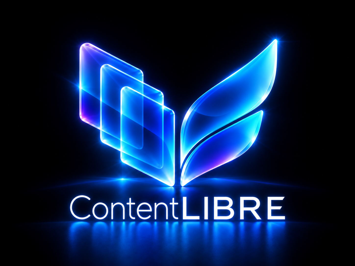
The home page hero artwork. Use it large, on midnight, and not for small labels.
Download Glossy expressionUse the standard mark on inner pages. The header and footer use the horizontal lockup at a fixed width; do not stretch it.
Use the glossy image at a generous size in the homepage hero. Do not make small navigation labels depend on effects or raster text.
Headlines, slogans and the long-form name remain HTML. Never bake the navigation or page copy into a decorative image.
Always write ContentLIBRE: capital C, lowercase ontent, uppercase LIBRE, no space. The primary slogan is “Your content. Your platform.” “Open possibilities.” is the supporting line. “Open source. No vendor lock-in.” is the open-source message.
The optional long form is “Content Lifecycle Integrated Bundle Runtime Environment.” Use it on the project page or in supporting material, not as the main headline on every page.
Use one mark, a clear type hierarchy and space—not repeated effects—to create consistency.